SwiftUI API Design: Sheet I
You’re looking at that title and probably thinking, “not another gosh darn SwiftUI bottom sheet implementation!” And to that I’d say that you’re probably right to be skeptical. However, I think this series of posts could be worth your while. This isn’t just about .sheet, it’s about SwiftUI API design. I will try to keep my final implementation as close as possible to the Apple version as possible, and try to peel back how they achieve the API they have.
SwiftUI Sheet
Let’s begin with an exploration of the native .sheet modifier, and see how it works.
SwiftUI’s .sheet modifier defined on View, and has two initializers:
// 1
.sheet(
    isPresented: Binding<Bool>,
    onDismiss: (() -> Void)?,
    content: () -> View
) -> View

// 2
.sheet(
    item: Binding<Identifiable?>,
    onDismiss: (() -> Void)?,
    content: (Identifiable) -> View
) -> View
The first is simpler than the second. In the first initializer, sheet takes a boolean Binding, which determines whether the sheet is shown or not. When the value of isPresented is set to true, the view built by the content view builder is presented. When it is set to false, the sheet is dismissed.
The second initializer, instead of taking a boolean Binding, takes a Binding to an optional Identifiable value. When the optional value is non-nil, the view built by the content view builder is presented. The view builder takes as a parameter the non-optional version of the binding’s value. For example, if you pass a Binding<CustomItem?>for item, the content view builder would take a CustomItem as a parameter ((CustomItem) -> View would be the signature.)
Both initializers also have an optional onDismiss closure that is triggered when the view is dismissed with by a system behavior, for example, a downward swipe on iOS or iPadOS. This is why we have a Binding to the item value and the isPresented value: the sheet needs to be dismissible by SwiftUI. If it is dismissed, it updates isPresented and item accordingly.
But why does .sheet look like this? It’s all about progressive disclosure: the idea that common cases should have simple call sites, but there should be more power if developers need it.1 The first initializer is a perfect example of keeping the callsite simple. All you need is this:
.sheet(isPresented: $isPresented) {
    Text("Hello World")
}
But if you need more control, you can do this:
.sheet(item: $item, onDismiss: {
    print("Sheet dismissed!")
}) { item in
    Text(item.text)
}
SwiftUI also embraces composability instead of enumeration. Instead of adding all of sheet’s options to the .sheet modifier itself, SwiftUI opts to put them into supplementary view modifiers, like .presentationCornerRadius and .presentationDetents. This is what a cluttered API would look like:
.sheet(
    item: $item,
    presentationCornerRadius: 50,
    presentationDetents: [.medium, .large],
    onDismiss: {
        print("Sheet dismissed!")
    }
) { item in
    Text(item.text)
}
Instead, SwiftUI does this:
.sheet(
    item: $item,
    onDismiss: {
        print("Sheet dismissed!")
    }
) { item in
    Text(item.text)
        .presentationCornerRadius(50)
        .presentationDetents([.medium, .large])
}
That might not seem like much, but it quickly adds up. This also allows the SwiftUI team to add more functionality to sheets without breaking changes. Just add a new view modifier! We’ll explore this more thoroughly in future parts of this series.
For now, let’s implement the simple case.
A Rough Implementation
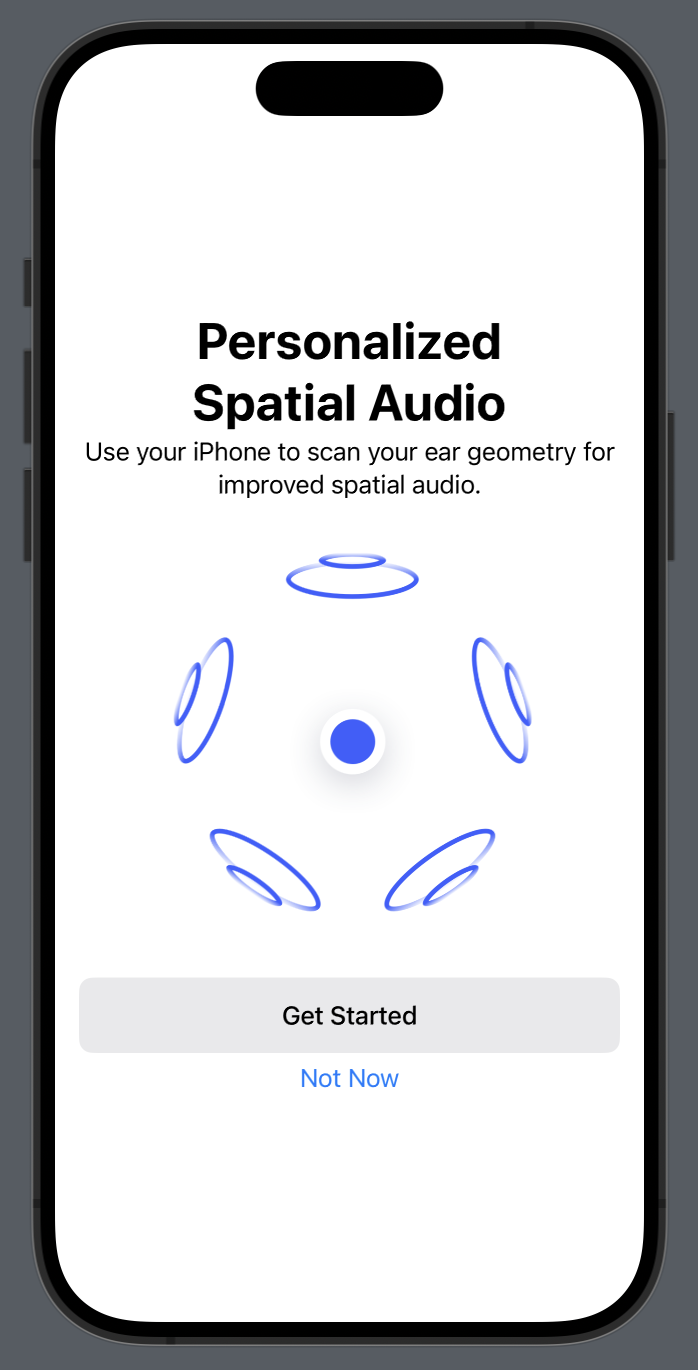
First, let us see what look we are targeting for our new sheet modifier. We’re going to try and recreate this sheet that apple uses for many of its apps, including spacial audio, and to show AirPods battery status.

First, let’s try to achieve the style with no view modifiers. Just VStacks and ZStacks.
I wrote a simple View that will be my sheet’s content, trying to match the screenshot above. It’s not important to this post, but here’s the code. This is what it looks like:
Now we move to the actual sheet.
We begin with a simple base View on top of which we’ll put our sheet:
struct ContentView: View {
    @State var isPresented: Bool = false // 1

    var body: some View {
       	ScrollView {
            VStack {
                Image(systemName: "globe")
                    .imageScale(.large)
                    .foregroundStyle(.tint)
                Text("Hello, world!")
                Button("Present Sheet") {
                    isPresented = true
                }
            }
            .padding()
        }
        .frame(maxWidth: .infinity)
	}
}isPresentedis the binding we will eventually pass into our custom sheet modifier.
Next, we wrap the whole thing in a ZStack and add our sheet conditionally, based on isPresented:
struct ContentView: View {
    @State var isPresented: Bool = false
    @State var offset: CGFloat = 0

    var body: some View {
        ZStack(alignment: .bottom) {
            ScrollView {
                VStack {
                    Image(systemName: "globe")
                        .imageScale(.large)
                        .foregroundStyle(.tint)
                    Text("Hello, world!")
                    Button("Present Sheet") {
                        isPresented = true
                    }
                }
            	.frame(maxWidth: .infinity)
                .padding()
            }
            .overlay { // 10
                Color.black.opacity(isPresented ? 0.3 : 0.0)
            }

            if isPresented {
                InnerView() // 1
                    .background(.background.secondary, in: .rect(cornerRadius: 50)) // 2
                    .padding(4)
                    .gesture( // 3
                        DragGesture(coordinateSpace: .global)
                            .onChanged { value in
                                offset = clip (
                                    value: value.translation.height,
                                    lower: -30,
                                    upper: .infinity
                                )
                            }
                            .onEnded { value in
                                if value.translation.height > 30 {
                                    isPresented = false
                                }
                                offset = 0
                            }
                    )
                    .drawingGroup() //4
                    .zIndex(1) //5
                    .offset(y: offset) //6
                    .animation(.spring, value: offset) // 7
                    .transition(.move(edge: .bottom).combined(with: .opacity)) // 8
            }
        }
        .animation(.snappy(duration: 0.3), value: isPresented) // 9
        .ignoresSafeArea(.all, edges: .bottom)
    }
}
There’s a lot of modifiers here, so let’s go line by line:
- InnerView() is the contents of our sheet. It’ll be replaced by a view builder later on
- The background, view with constant corner radius. Getting the corner radius of the device requires use a private API (shh…)
- This is the gesture that lets the sheet dismiss when swiped down.
drawingGroup()makes sure that the whole sheet is animated as one unit instead of letting the animations trickle down to the individual views.- A
zIndexis necessary of greater than 0 is required to make sure that the sheet stays above the overlay on the bottom layer. - The offset that is controlled by the drag gesture.
- An animation that makes dragging the sheet feel more… buttery.
- A transition for when the view appears and disappears.
- Setting the animation curve for said transition.
- An overlay to darken the view behind the sheet.
Here is what it looks like:

And here it is in action:
Making the View Modifier
Now that we have that, we can begin trying to make this into a view modifier. This isn’t actually very hard. First, we need to define our view modifier:
struct CustomSheet: ViewModifier {
    func body(content: Content) -> some View {

    }
}
content here is the View that this modifier is applied to. In our case, that will be the ScrollView from before. We also need to capture the content that will go in our sheet. To do so, we need to define a @ViewBuilder, which allows us to accept a SwiftUI View in a closure. But what will the type of this be? Since it’s a ViewBuilder, it must be a closure, but what is the result type? It must be able to accept any type that conforms to View, so we use a generic.
struct CustomSheet<SheetContent: View>: ViewModifier {
	@ViewBuilder var sheetContent: () -> SheetContent

	func body(content: Content) -> some View {

    }
}
Finally, we can port over all our functionality from the previous section:
struct CustomSheet<SheetContent: View>: ViewModifier {
    @Binding var isPresented: Bool
    @State var offset: CGFloat = 0

    @ViewBuilder var sheetContent: () -> SheetContent

    func body(content: Content) -> some View {
        ZStack(alignment: .bottom) {
            content
                .overlay {
                    Color.black.opacity(isPresented ? 0.3 : 0.0)
                }

            if isPresented {
                sheetContent()
                    .background(.background.secondary, in: .rect(cornerRadius: 50))
                    ...rest of the modifiers
            }
        }
        .animation(.snappy(duration: 0.3), value: isPresented)
        .ignoresSafeArea(.all, edges: .bottom)
    }
}
We can also extend View so that our sheet modifier is easy to apply:
extension View {
    func customSheet<SheetContent>(
        isPresented: Binding<Bool>,
        @ViewBuilder sheetContent: @escaping () -> SheetContent
    ) -> some View where SheetContent: View {
        modifier(
            CustomSheet(
                isPresented: isPresented,
                sheetContent: sheetContent
            )
        )
    }
}
And with that, our callsite now looks like this:
struct ContentView: View {
    @State var isPresented: Bool = true

    var body: some View {
        ScrollView {
            VStack {
                Image(systemName: "globe")
                    .imageScale(.large)
                    .foregroundStyle(.tint)
                Text("Hello, world!")
                Button("Present Sheet") {
                    isPresented = true
                }
            }
            .frame(maxWidth: .infinity)
            .padding()
        }
        .customSheet(isPresented: $isPresented) {
            InnerView()
        }
    }
}
Much nicer! It already looks fairly similar to SwiftUI’s sheet. There are some fairly obvious issues, though:
- There is no
onDismissclosure. - The second initializer is unimplemented.
- Safe areas might be broken, since we ignore the bottom safe area on the whole ZStack.
- We haven’t even begun thinking about how to implement the various view modifiers that affect SwiftUI’s sheet presentation.
For now, though, this is good. We’ll tackle all these issues in Part II.
All the code for this project is on Github
Footnotes
-
For more information on SwiftUI API design, watch the session titled The craft of SwiftUI API design from WWDC22 ↩